6.2.14

inspiring

wooah, il love this colour combination! (i know, this sounds a lot like yesterday :-))

the celadon green against the bordeaux/brown - pinstripe grey - gold with the pebble backdrop... and throw the textures in the mix.

take the ring away and this to me is a masterpiece.

mental note to myself: watch and learn!

pic snapped out of a magazine

Labels: ,

7.10.13

bowled over


... by shades of grey - and i don't mean the book.

a week later than planned the ceramic order finally went out...

could i order all the pieces in all the colours that would greatly simplify matters!

but putting the order together (streamlining, streamlining) is still much more pleasant than unpacking... but for that later.

so while waiting for delivery, here the beautiful colour palette chosen by nathalie, who kindly sent me this pic.

ps: the tray (one side black, other side in red or clear blue) is also available in the shop.

Labels: ,

3.6.13

peace & quiet


last saturday alessandra sent me a photograph of these two ceramics she bought in the shop a while ago.

a soothing still life. the vessel to the right can serve as a vase, pencil or candleholder.

have a good start into this week everyone, for me it's count-down for the early summer holidays! (!!!!!!!!!!!!!!)

Labels: , ,

28.5.13

tough decisions


i'm not sure i would dare paint a wall in charcoal black, but it does look amazing. 

had i one more room (shop or home)... then perhaps. all the colours are enhanced against this dark background (if you have enough light that is).

also i'm tempted by these boxes. maybe it's got to do with my phantasy (and utterly unreachable goal) of a clear desk. to throw all the knick-knacks on your desk into the box: easy peasy. but certainly i look less commanding when i poor the contents on the floor to find what i'm looking for? 

would YOU buy a box?? i've got my finger on the trigger.

btw: i also like the neon pink tape for a collage. available in the shop of course!

pic via cool nordic. 

Labels: , , ,

12.4.13

bring on the colours!


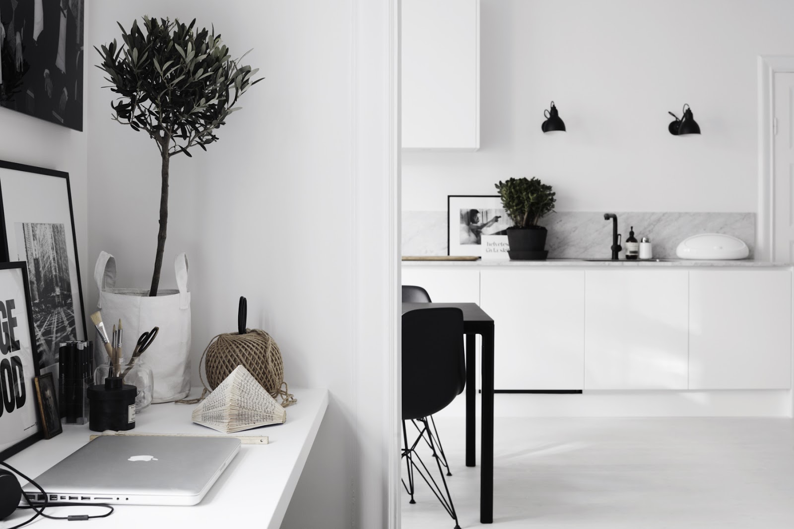
i don't know if you're a reader of living magazines or blogs, but if you are, then you will have noticed the scandinavian trend for all "black-white-wood" that has prevailed for the past few years. and that seems to have been picked up by the cool crowd everywhere else. i could show you zillions of photos, but let's just have two:


pics by kristofer johnsson

now this looks like a beautiful appartment (space-window-floor-walls) but i would NEVER EVER like to live in a black-white-wood colour scheme. where is the juice?

how about you?

ps: i have bought 2 pink wood chairs. say the pink of a newborn (read: clean) piglet. more on that next week.

Labels: , ,

11.1.13

blue but not in a sad way


two days ago i was contacted by a company for african textiles... with a norwegian creative director... that makes  for a good north-south shake-up!

have a nice weekend everybody, sunnier days are waiting for us for sure :-)

picture via maison française.

Labels: , ,

23.9.11

fall fairy


i tear out magazine sheets and download many pictures for inspiration and then i can't remember where i got them from. this picture i saved under Paulo Roversi because i knew i would post it some day... now i just came across this luminous picture again and thought today, on a fine autumn saturday, was just the day. beautifully unreal and enchanting, don't you think?

believe it or not, the colour/print mix and the texture reminds me of pictures i've seen with carpets, i'll make sure to post them soon. happy week-end everyone!

Labels:

19.9.11

pops of colour, bang! bang!


i don't know about you but a dark and rainy sunday like yesterday makes me yearn for colour (maybe the fact that i had to work on my tax declaration made me feel even more gloomy). every autumn i tell myself to buy coloured jumpers for the cold days but i usually end up with greys, black and other dark colours all the same... so boring! an easy way to perk up is with accessories like shawls or at least a colourful bracelet like the ones pictured above. also available with silver pendants.

Labels: ,

12.4.11

deep purple, yellow and green


remember the intriguing purple-yellow-green colour mix of the interieur photo i posted on april 1? so when i saw these dark tulips i wanted to recreate that colour scheme and so added some buttercups. dark & dangerous next to light & charming, all rather "little red cap and the big bad wolf" if you see what i mean.

Labels: ,

1.4.11

...somehow my text has disappeared, so i post this seperately. photo 1 is a random shot taken at my local bus station; for photo 2 i juxtaposed two individual tear-sheets of magazines and photo 3 is by garance d. of an italian a/w collection (sorry, can't remember which one). aren't these moss greens, greys, deep purple and spicy yellow just wonderful in the mix?

Labels:

inspired by nature - beautiful colour combinations (2)


Labels:

23.3.11

shades of grey and red


not the same style but a similar colour combination... saskia & renato chose this beautiful red (RAL 3002)and matched the dark grey (RAL 7024) with their sofa. way more refined than black.

Labels: ,

23.6.10

citrine, amethyst & aquamarine


it's not really a good picture but i like the gemcolours that remind me of semi-precious stones. aren't these little tables cute? sturdy steel for indoor/outdoor use. more colours available (poppy red, orange, willow green).

Labels: